Tracking flight prices
16 Aug 2019
Context
The goal of this project was to design a flight tracking email notification for the client. The client, greatescape.co, is a flight aggregator product backed by Singapore-MIT Alliance for Research and Technology (SMART). They had a great product which used hundreds of flight ticket providers as its data source. More often than not, it was able to find cheaper prices than more obvious flight aggregators e.g. Kayak or Skyscanner.
They developed an algorithm to track flight prices from a certain origin to a certain destination. One of the unique features of this algorithm was that the destination could be fuzzy, meaning one could add a country, or a region as the destination instead of a particular airport.
Constraints
- Integration
The design solution had to be integrated with the existing product experience and interface. - No user accounts
The product did not have any user accounts, and the resulting solution had to respect that. - Email only
The price deal/drop notifications that users wanted to watch out for were to be sent by email. - Popup
The tracking interface had to be within a lightbox.
Challenges
- Where to hook
The product had an interface with map being the center of all the interactions, the tracking had to fit into it. - Lack of user feedback
The company was a small startup with almost negligible time for interacting with users. - Quick release cycle
Both mobile and desktop interfaces had to be designed within a week, and developed in the following week.
Where to hook

User flow for flight tracking
All the inputs that existed on the webpage were interacting with the map directly or indirectly. One could easily put a “track flights” button in the bottom interface, but it would have broken the synergy that the interface had with the map. A button (or a link) was required to hook into the tracking interface which could then allow users to manage the flights they are tracking.

screenshot of existing product home page
The position of the hook (or call-to-action, CTA) was a point of discussion in multiple meetings even after I started designing the interface to manage flight tracking. An observation about myself, made me realize that the most natural place where I felt like tracking a price was immediately after I search for a flight ticket. After a bit of discussion, we added a CTA on flights list page, which appeared after a user selected the origin and the destination cities.
![]()
Flights-list page with track prices button
However, for both business and design reasons, redundancy is a good practice. This was especially true for this case as the flight tracking was possible for countries and regions (not just cities). So we added another CTA for flight tracking right next to the destination search bar which will take the user to tracking interface with pre-filled destination (same as the destination search bar).

Tracking icon in the destination search bar
Designing interface
We lacked the infrastructure to do A/B testing for our ideas, while only having the time to pursue one of the ideas. So without questioning the lightbox constraint, I designed with it.
Initial screen for tracking flights
The initial wireframe was designed considering that the CTA to reach this interface will only be available once the city had been chosen. As I learned about the ability of the algorithm to track prices to countries, continents or regions, I realized that the ability to change the tracking destination should be present. The following were the iterations for the design.
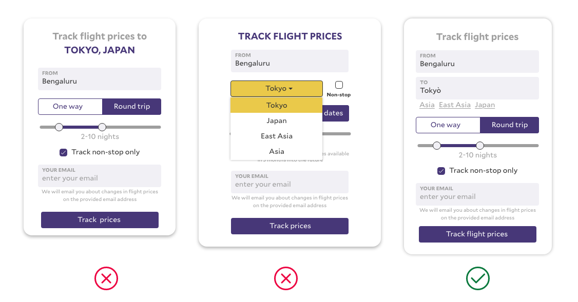
Tracking popup wireframes and decision
Completing the flow
The following are the rest of the screens for the whole experience that follow the similar design language. The user email was the only identifying input we asked for, not even a password. The users had the ability to unsubscribe (or say they didn’t sign up) from the email we sent them when they started tracking flights.

The tracking flights management and addition screen after email input
Desktop version
The desktop provides for a lot more space as compared to the mobile devices. There was room for more functionality in one view, which we did. And here was feature parity between desktop and mobile screen interfaces.
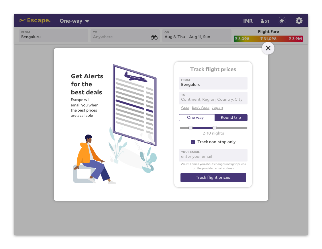
Tracking initiation interface on desktop

Tracking management and addition screen on desktop