Affordable sensor
The sensor to be used for data collection had to be commercially available and affordable.
12 Jun 2018
This project was done for the Consortium for Technology for Proactive Healthcare at Northeastern University in Boston. The lab conducts studies for utilization of new technologies for proactive healthcare. The goals of these studies vary from changing/developing habits of the participants to testing the feasibility of a particular commercially available device for health tracking. This project dealt with improving sleep habits, and understand their relation to mental stress recovery of the body. Mental stress is known to affect sleep quality and circadian rhythm. Conversely, better sleep patterns help with mental stress management.


There were numerous sleep sensors that are commercially available. We bought a bunch based on their data access and usability. We tried each one for a week and checked the data output’s accuracy. The accuracy was checked by observing our sleep times and crosschecking it with the data output.
Apple watch, although quite accurate, was ruled out because of its iOS only compatibility. The participants of the research could not be expected to own an iPhone, as it will narrow down the number of people who could sign up for the study.
Fitbit sensors were also great. Fitbit scored very well as a contestant because of its accuracy, platform compatibility and pricing. It was definitely one of the sensors we considered to be used for the whole study.
Emfit Quiet sleep sensor was the final choice for the study. It had all the features of Fitbit except it didn’t need to be charged or even worn. It was much more non-intrusive in the lives of participants than any other sensor available. It sat under the mattress of the participant, and was plugged into the wall for power. The participant doesn’t need to remember to charge or wear it.
I consider gathering domain knowledge as a responsibility of the designer(s). Since I am not a medical expert, while working on this project I had to gather knowledge to understand the needs/requirements of the project better.
I read the device documentation and academic literature about sleep and physiology. Along with that, I conducted meetings with health coaches to understand which parts of the data are the most relevant for their analysis of the participants’ sleep. The most important insight for me was realizing that deep and REM sleep could be classified as one for this project.
The Emfit sensor gave access to a lot of data through their API. I figured out which ones of those variables are useful for the health coaches. The following were the most useful variables to understand sleep quality:
The data to be represented in the visualization was much more complicated in its raw form (as fetched by the API) than expected. The sensor recorded a reading every 4 seconds for a given sleep cycle. Let’s assume that a sleep cycle was 6 hours long; it meant that we will have 5400 rows in our data table for a single sleep session of a participant.
This amount of data needed to be processed to be visualized as required. I used an AWS lambda function to fetch, process, save and send this data to the frontend.
After understanding the constraints, problems, challenges and working through them. It was finally time to wireframe the data visualization. This UI was designed as a module of the NUCoach platform that the lab had built over the years for conducting such studies.

The dropdown list wasn’t chosen because a normal one has an advantage of showing exactly which participant is currently active, how many participants are there and who are other participants.
There are a limited number of ways to visually encode data on a 2-dimensional screen. The most easily differentiable visual elements are position, length, colour, area, colour value (think saturation) and opacity, respectively.
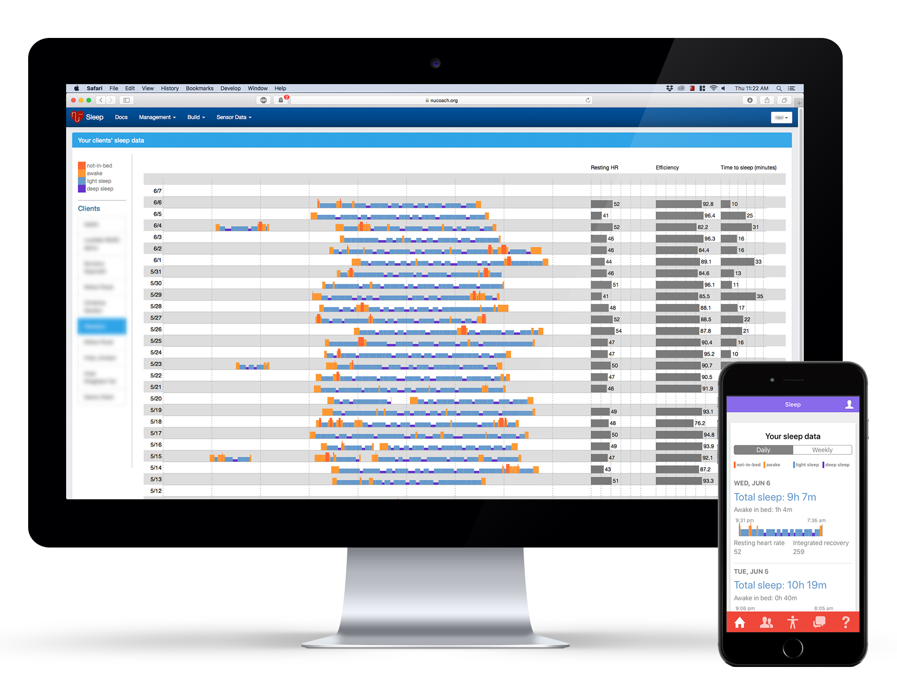
Since sleep time was the most important variable for the analysis, it was encoded as position and length. The x-axis being the time (midnight to midnight), the bars were encoded as different phases of sleep (awake, light and deep).

The colours of the bars were varied for encoding the sleep phase. Putting multiple days together, as in the picture below, made it very easy to identify the bed-time variance of the participant. Accordingly, health coaches could advise the participant.

However, the x-axes (time) was designed midnight to midnight which split up the major sleep session among 2 dates. The first part of the sleep session was on the extreme right (end of a date), while the second part was on the extreme left. The solution I came up with was to change the time-scale to noon-to-noon, which was welcomed by the health coaches.

The remaining 3 variables were also added as bar-charts for each day for easy comparison, as most people understand bar-charts readily.
Once the wireframes were ready, it was time to design and build the UI. The choice of colors was easy to make as NUCoach interface already had a design language. The red color is generally associated to danger (or something not desired). So reds (warm colors) were used to signify 2 stages of a sleep session: awake and not-in-bed. While cool colors were used to signify: light and deep sleep.

The wireframes dicussed earlier in this post were put together with the design language of NUCoach in order to achieve the result. However, there were some changes in the visualization after the subsequent demos of the project. Some of which are discussed in the next section.
The UI design for particiapnts had to be easy enough to use for people with mild brain damage who may not be able to differentiate colours or read or communicate properly. The participants were accessing the interface through their phone apps.
A visualisation similar to the health coaches was provided to the participants. When a health coach offers advice based on data over the phone, the participant also needed something similar to refer to if they wanted to.

We quickly realized that the redundancy of the visualization wasn’t enough. We also added the height for sleep phase and text on phone for redundancy purposes. The participants had varied consequences of brain damage. The height helped colourblind people while the text helped people with difficulties in reading shapes. The text also added more precision since we could not have hover-tooltip in mobile devices.
The project was deployed and study was conducted on over 50 participants and their health coaches. After a couple months, health coaches and participants saw an exponential improvement in the health advice and recovery. The sensor data is much more accurate, precise and detailed as compared to the self-observation done by the participants or their care-takers. This results in a better understanding of patients for health experts and a better healthcare advice for the patients.
The UI I designed and developed for was a success as compared to the Emfit dashboard that comes with the device because of multiple reasons. A few of them being: