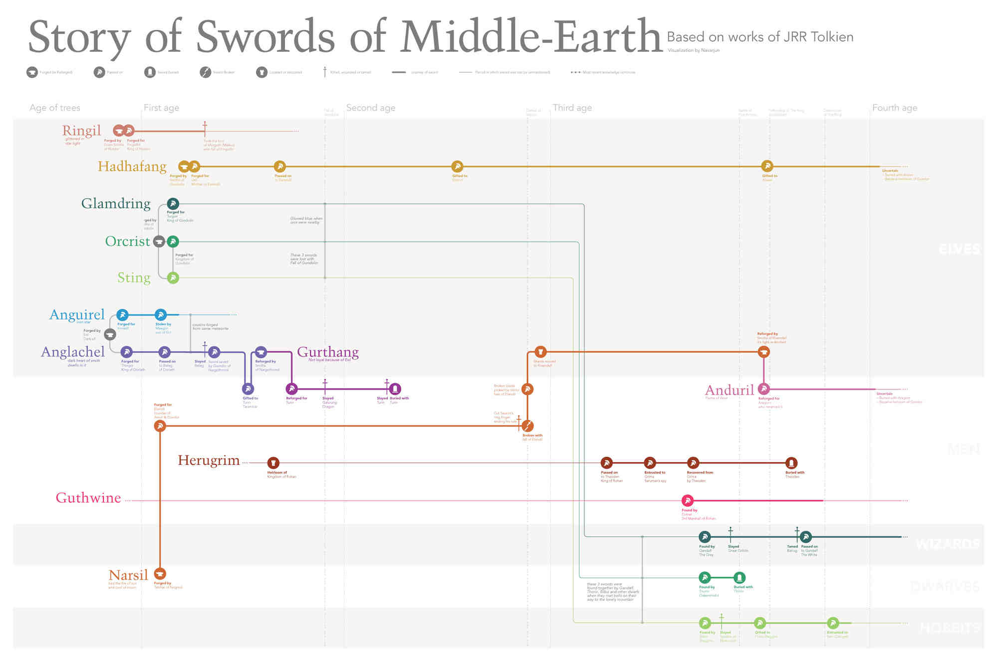
Story of swords of middle-earth
07 Jun 2017
This project was done as a one week assignment for a Information Design History class taught by Paul Kahn at Northeastern University in Fall of 2016. The requirement of the project was to design a genealogy of _something_—the choice was left up to the students. Some students did their projects on their own families, some picked up their favorite books, a student did her project on evolution of dogs. Doing and discussing these projects we got to learn more about how the same problem of representing genealogy could be approached in different ways, and all representations have their own pros and cons.
One of my classmates, Andrew Tang who had taken gone through this class last semester, had created the genealogy of important people in Game of Thrones. I had always been into Tolkien universe, and co-incidentally I was reading Lord of the Rings(LOTR) those days. The choice was obvious, I picked LOTR as the topic for my assignment. As I searched the web for good data source, I realized that a lot of genealogy diagrams of LOTR already exist. So I decided to add a little twist to mine: instead of people being the main characters in my visualization, swords would take the front stage. Soon I realized that I have signed up for a difficult data collection project. The LOTR Wiki helped a lot. But I still had to go through a lot of pages of reading and writing everything down.
First drafts
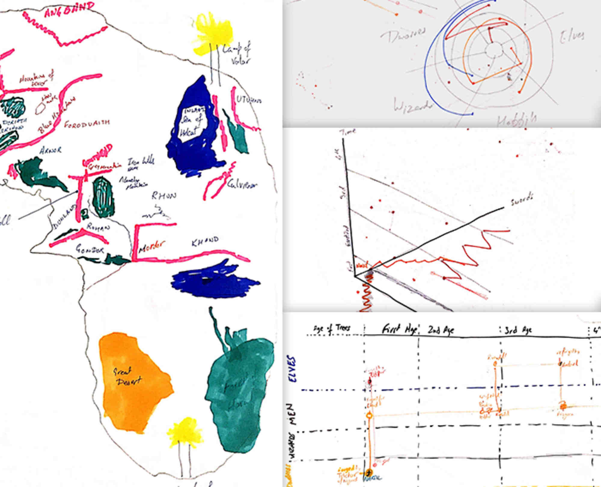
My hand sketches while collecting data and understanding data
I started drawing the ways I could visualize the data I collected over 4 hours. Drawing map of Middle Earth was my initial instinct, as a lot of other visualizations about LOTR are based on maps but instead of focusing on the swords it was focusing more on geography and events that happened. The story of the swords would only be visible if I drew a timeline with events as part of it. When we read text, we read a random sequence of events and our brain arranges them in a particular order effortlessly to make the story apparent. I had to do something similar visually. This approach made me decide that geographical information was not as important as people involved with swords, as most people don’t remember the map of Middle Earth. Including geographical information would only add another layer of data that people would have to discover in the poster, distracting from the actual stories of Swords.
Going digital

I put together a poster within 4 hours that was doing a good job of telling the stories but it wasn’t good enough. I hadn’t worked on icons at all, they were very rough. Some parts were really crowded. Deadline was close so I took it to our studio space, where all grad students work, for feedback. The version of the visualization that I turned-in for the class is following.

I continued to work on this even after turning it in for the class. It kept improving with every iteration. The typefaces changed, icons got upgrades, colors became more consistent, lines became much less distracting and so on…
Acknowledgements
I would like to acknowledge Andrew Tang, Lia Petronio, Xingyue Li and Mahima Pushkarna without whose critique it wasn’t possible. And most of all Douglass Scott, who encouraged me to take it to next level. Thank you guys!
If you are interested in getting a printed copy, I would love to ship it to you. Please visit the shop or connect on Twitter (@Navarjun) or email (navarjun.singh@gmail.com)