Romania | Infographic
18 Dec 2016
This project was part of a class taught by Douglass Scott in fall 2016. Each student was assigned a country, for me it was Romania. And we had to create an infographic poster that would make us all learn more about information design. Doug would ask for drafts each week, and he (along with all students) would provide constructive feedback on the posters. The feedback was used to refine/modify the poster for next week. It was left totally up to the student about what feedback to ask for and consider for next iteration.
Data and First Draft
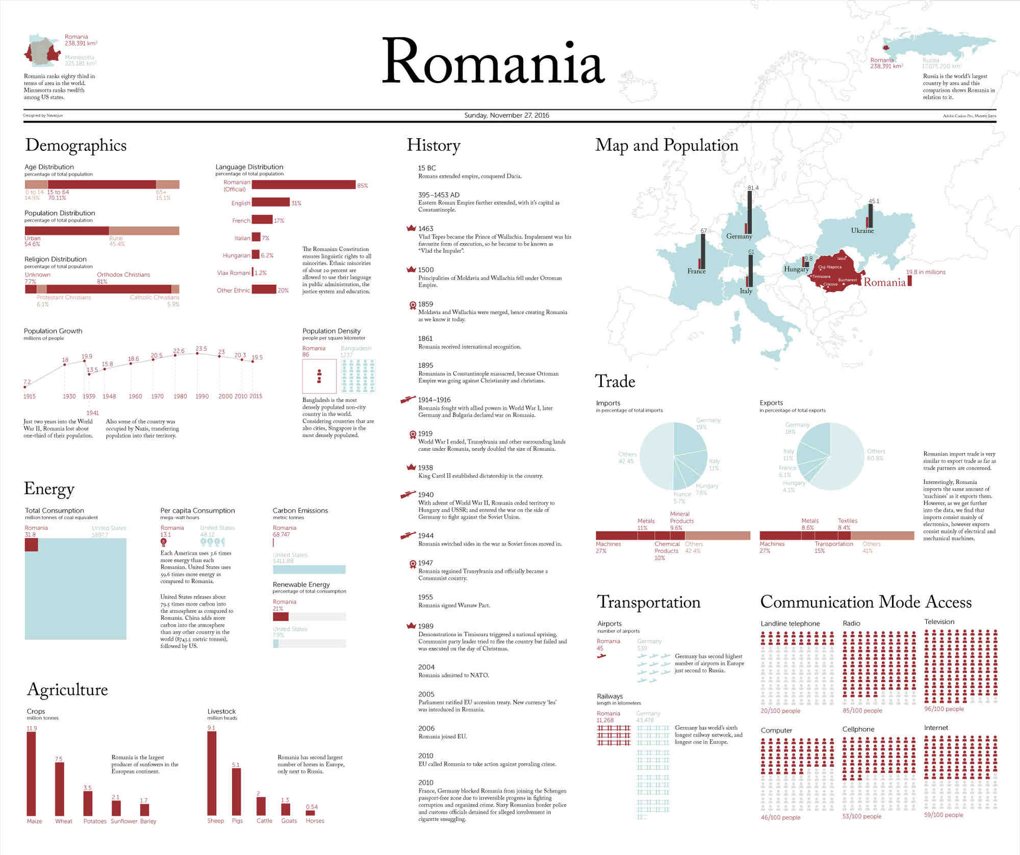
I started with looking at the data we had to include into the infographic and started categorizing data and figuring out which categories could go together. When it came to deciding the size of the poster, I decided to go with the standard poster size that I generally use 22x34 inches because of the plotter printer specifications in our university (it cannot be more than 36 inches on any side). I decided I would modify it as I need later on, since I didn’t start with all the graphics ready. The color palette came from the flag of Romania.The European map comes into the west, so I decided to keep it on the right side of the poster so it looks like it’s coming into the poster from right. However, if the continent was Africa or Australia, they have a perfect shape which can be placed anywhere on the paper.
Getting into Comparison
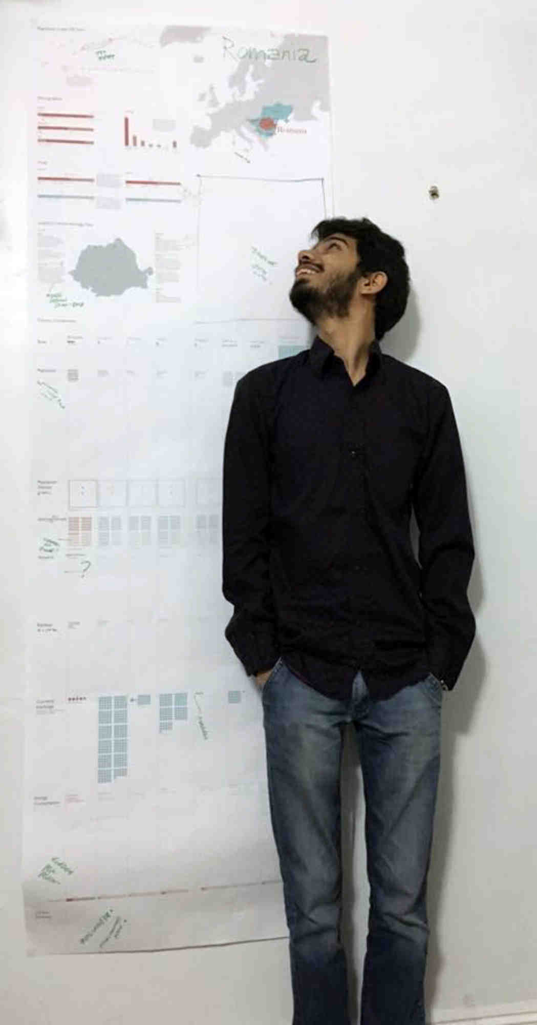
I wanted to look at how Romania compares with other countries that we were supposed to have in the graphic. So I created this exploratory poster that was almost as tall as me (actually taller by a couple inches).
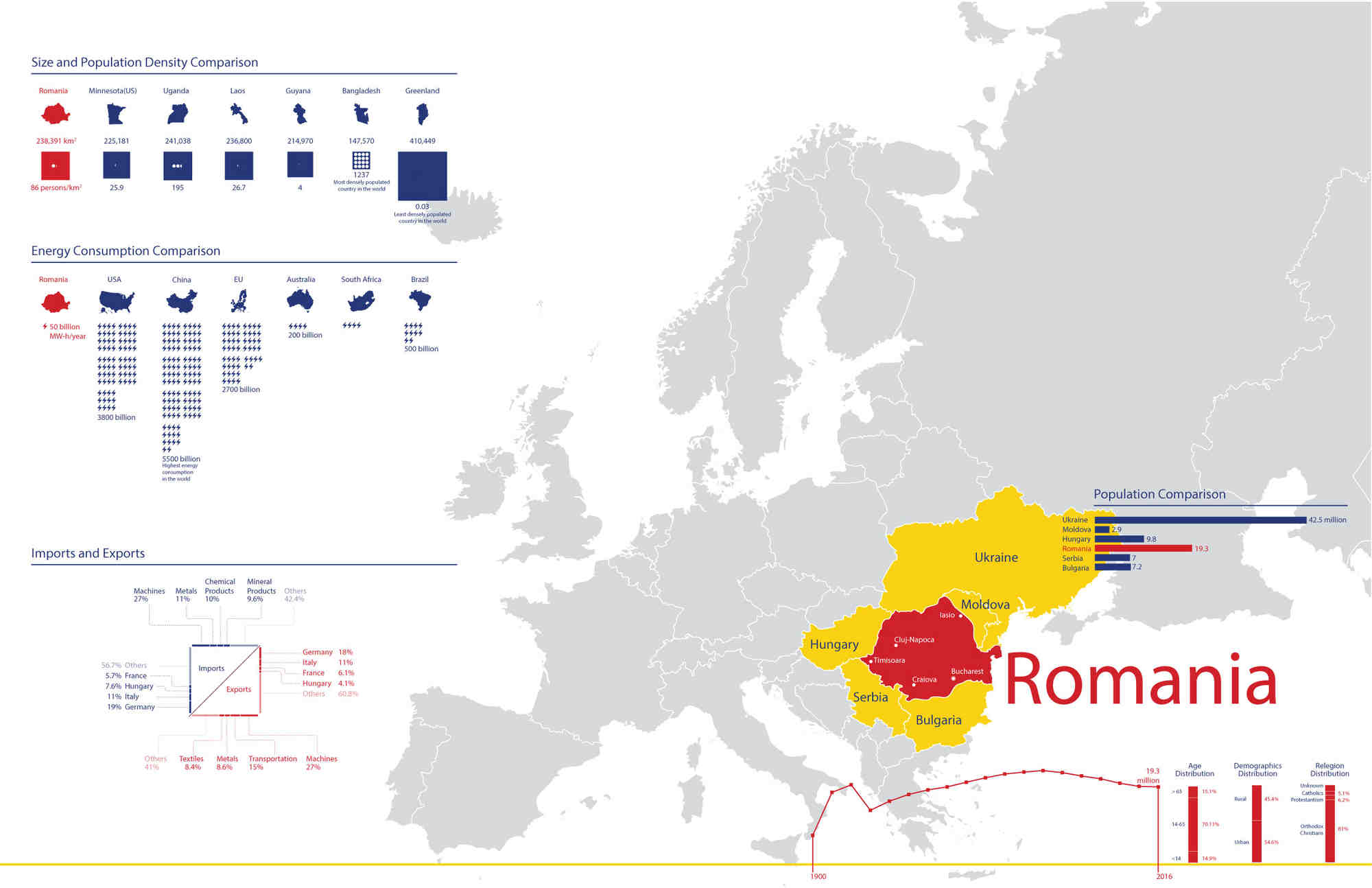
This iteration gave me a better idea about what I wanted to include in my final poster. Some of the iso-types I used also needed some refining. So yes, the next phase started.## Taking the newspaper metaphor (seriously)One of the other students in the class had this idea of creating a newspaper for his country—Taiwan. I felt like newspapers have a lot of detail in them, and I had already put together a infographic that had a lot of detail with rankings of different countries in the world. So, I decided to create a newspaper like poster. I have to agree that I took it a little too far.
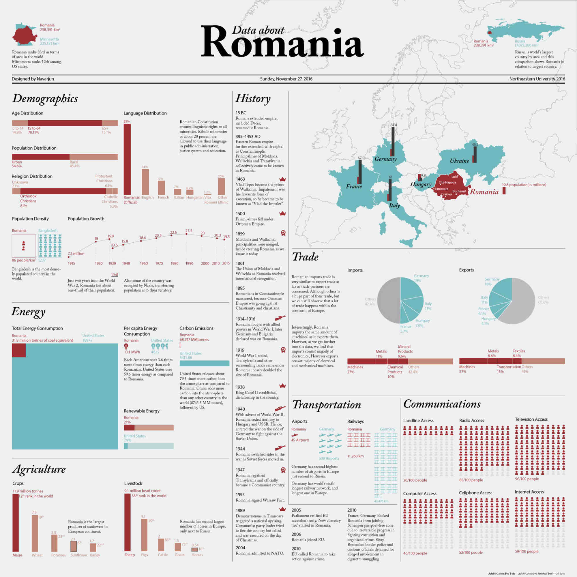
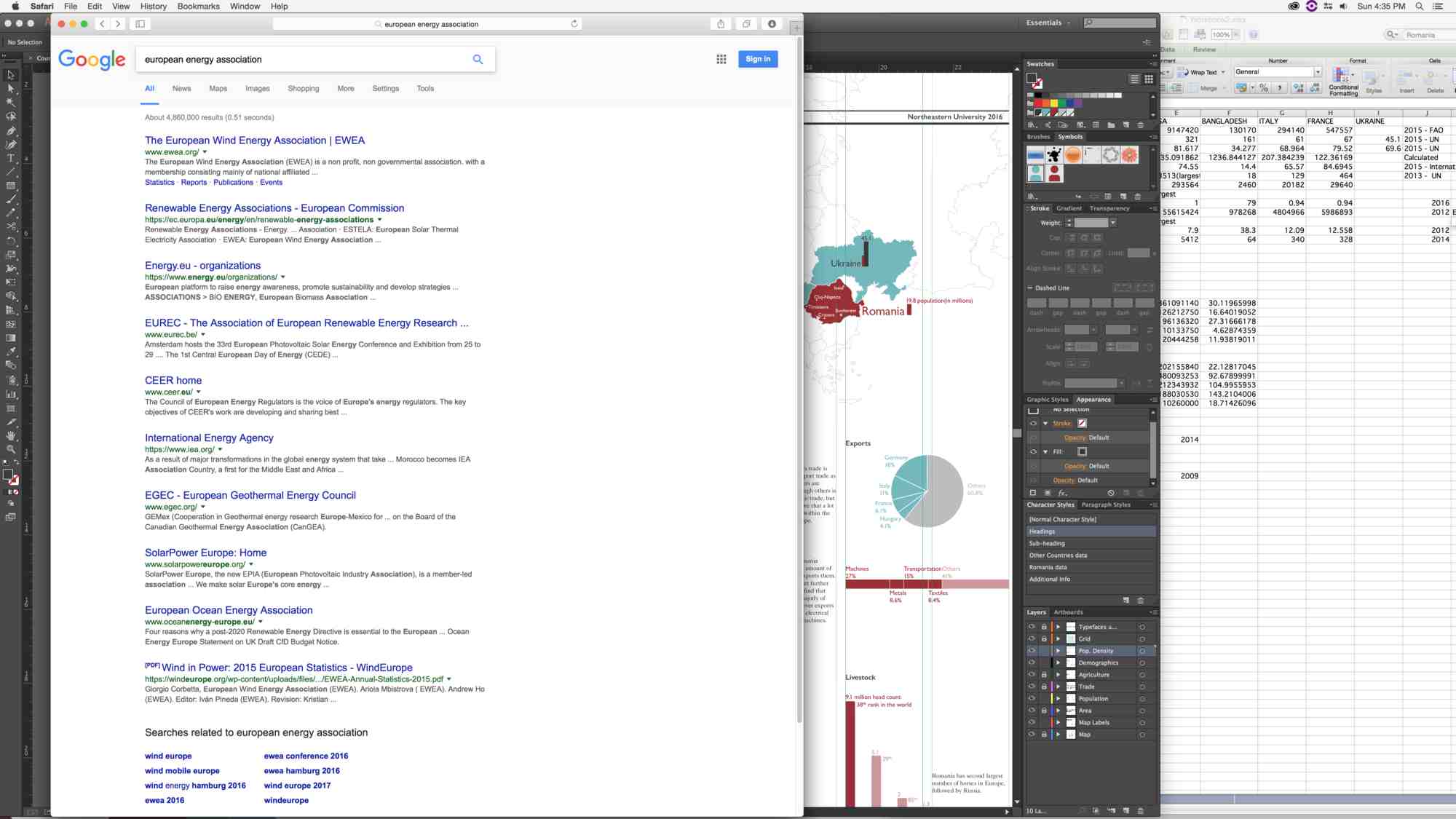
This poster was super full “like a newspaper”. There was no breathing room. Probably as a newspaper it would have made a lot more sense. But for a infographic, which people would look at, it was a bit overwhelming.## Final StepsThe previous iteration gave me a starting point for the final one. And I added some breathing room to make a better composition and muted the cyan a little bit. One more thing I observed in previous iteration was I needed to change the sans-serif typeface I was using for subheads and numbers—Gill Sans. Gill Sans is good as far as text is concerned but when it comes to numbers, the letter-spacing is not great. Number ‘1’ has a lot of space before it as compared to other numbers. So I started looking for a typeface that has a base for 1-glyph. Museo sans had that, and it paired well with the existing Adobe Caslon which I was using for title (heavier) and headings (italic). Finally, I was able to create something I am proud of.