Its my time
17 Dec 2016
This project was part of a class taught by Douglass Scott in Fall 2016. The assignment was to record a week of our own ‘media usage’ (or digital device usage) and try to visualize it in a poster or accordion form, so as viewers can look at it and understand the data behind the infographic. The amount of detail students wanted to add into their work was left totally up to the student.
However before creating any infographic, we had to collect the data. And these days there’s literally an app for everything. Some students used one or more of them to record their digital life. I couldn’t find anyone that could solve my purpose for the details of the usage I wanted to record. I wanted to record all the variables like app I am using, on what device am I using the app and did the work I did pay me financially or not, was it school homework, any parallel app usages, etc. I had no visualization in mind, which is the way I work.
I never have a goal where I try to reach, I always try to figure out what is the best goal to reach before actually going there.
First Draft
But since the data wasn’t ready I had to come up with some drafts that could express my data. Doug, at the beginning of the project, mentioned that it would be really hard to do this project without using colors. I took that sentence as a challenge for myself and decided to give one color infographic a shot. Following image shows what it looked like.
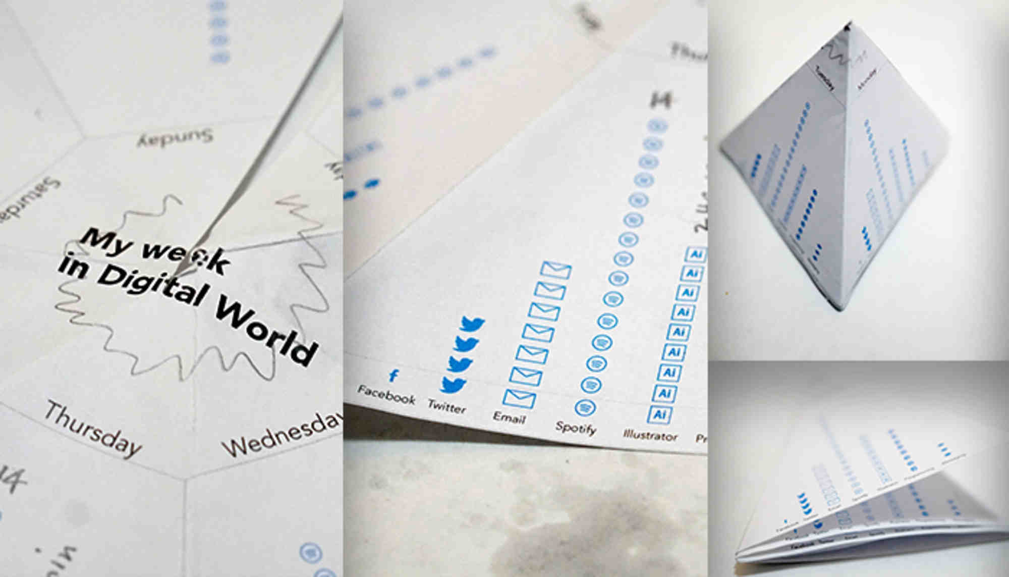
It was a heptagon form that folded into a little triangle, it could work as a desk top infographic by folding it into a triangular or square pyramid. I chose a heptagon form considering that there are 7 days in a week and they are cyclic — Monday to Sunday and then again Monday to Sunday. Although it was a very particular week, but most of my weeks look the same (I guess that makes me a boring person :P).
Collecting data and next steps
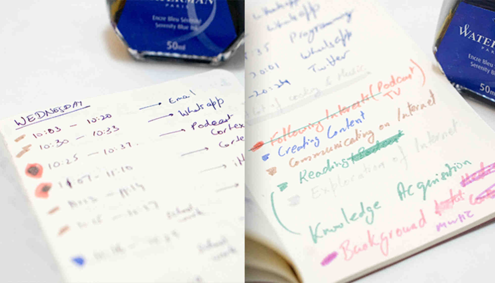
Believe it or not, collecting data was the most difficult part of the whole project. I am not used to writing everything I do, but somehow that week I was aware. It was challenging. At the same time, I would not say I was stopping myself from using more media while recording as happened with other classmates. Nevertheless, it was an enlightening experience.
After collecting the data I was literally overwhelmed by the amount of information I had to display on to a piece of paper. And I realized why Doug had mentioned that avoiding colors would be really hard. I started categorizing the data into different categories, which could fit themselves into the form I had already decided before looking at the data (it was definitely a bad idea to keep using that form). I failed!
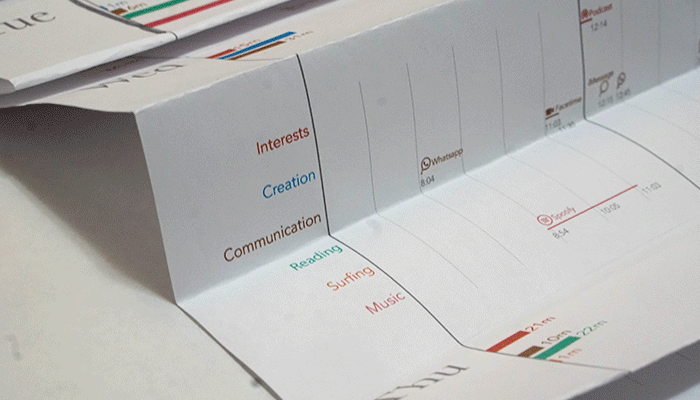
After a few hours of paying my head and some sketch paper, I realized that I have to use colors and definitely change the form. Then started about a couple hours of paper folding process. Watching some origami videos and another decision — since I was changing the form, it made sense to include more detail of the data. It was the birth of zoomable poster (one of my friends gave it that name).

This form made the viewer look at the overview of the week and as they folded it out they could see more in detail about what times of the day did I use what kind of media. Folding out the paper to the third level would let the viewer see all the 24 hours in a day (from 6am to 6am next day). It was a time consuming task to translate all the data into Illustrator using graph tool within illustrator itself. Following image shows what it looked like:
Final problems and solution
The problem with zoomable poster infographic was that the folding out to second level would give the viewer some bar-charts that were all the same scale. But folding out to third level gave thinner bars that were not the same scale as the second level bars. Making second level bars the same scale as the third level bars, made them so small that it was hard to see at second zoom level. However, colors were working great! (except I had to reduce the amount of red in the pink to make it really distinct).
It was a hard decision to take, but I decided to remove the amount of detail in my current poster. I definitely got influenced by Fathom’s Miles Davis visualization since I visited their office and they talked about it. They had managed to avoid using a lot of colors but they were able to show detailed information using interaction. The next iteration of this project led me to remove a lot of detail (as it wasn’t interactive) and was a total re-direction of the project.
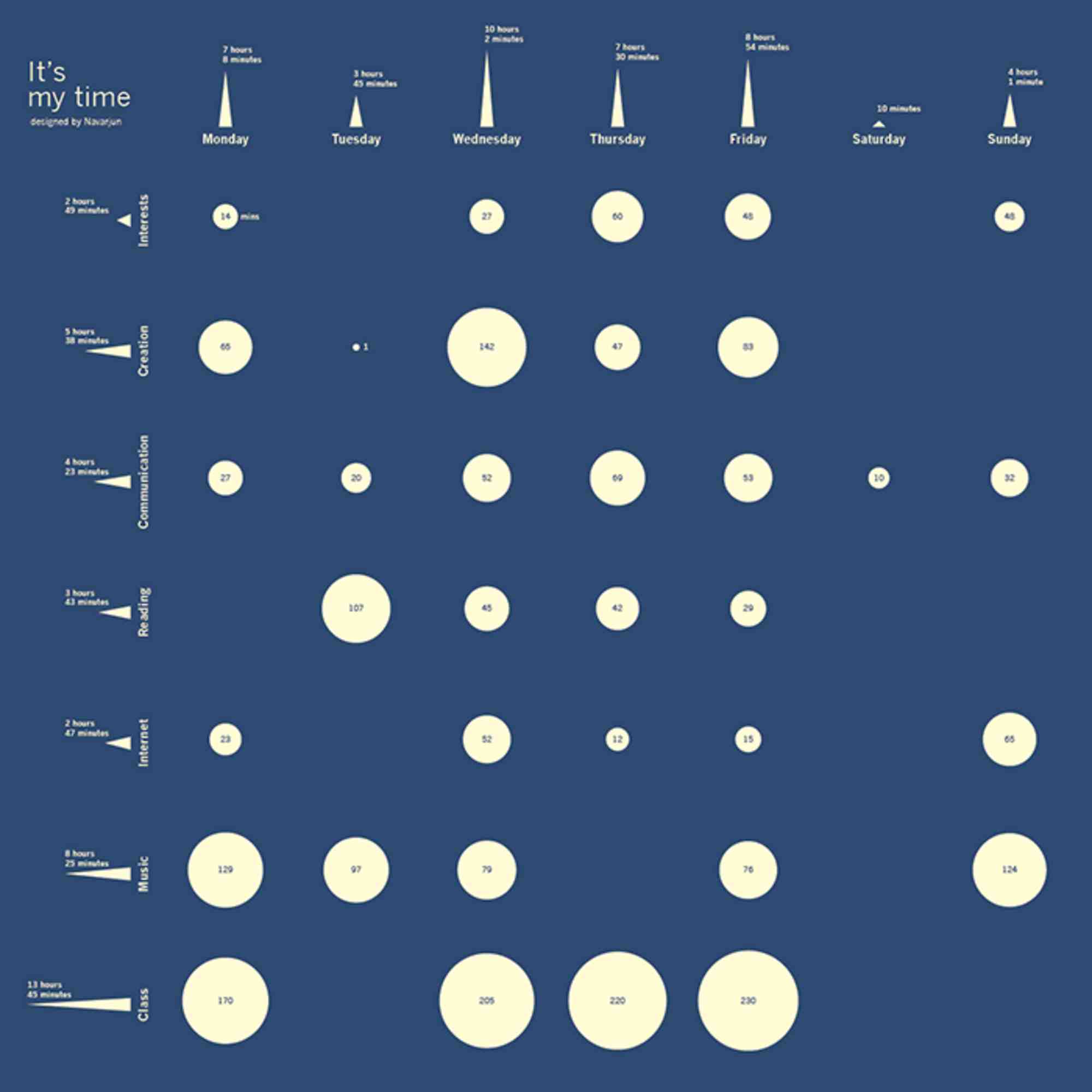
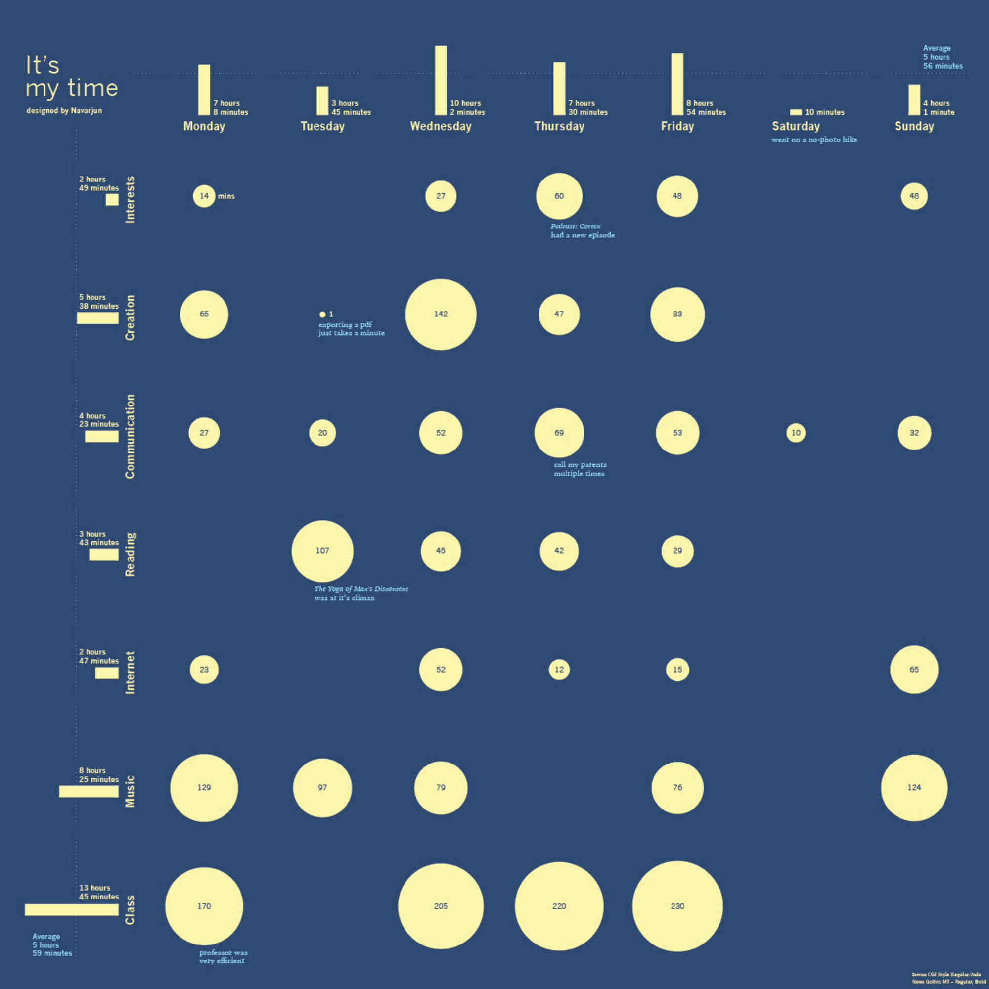
The triangles on the sides were just aesthetically decided to be triangles. But my data-viz nerd friends were reading triangles like the base meant something and the height meant something else. So I had to go back to bars, and with suggestion of some of those data-viz friends I added some notes and little details in the visualization. Following is the final version, and I am quite satisfied with the result.
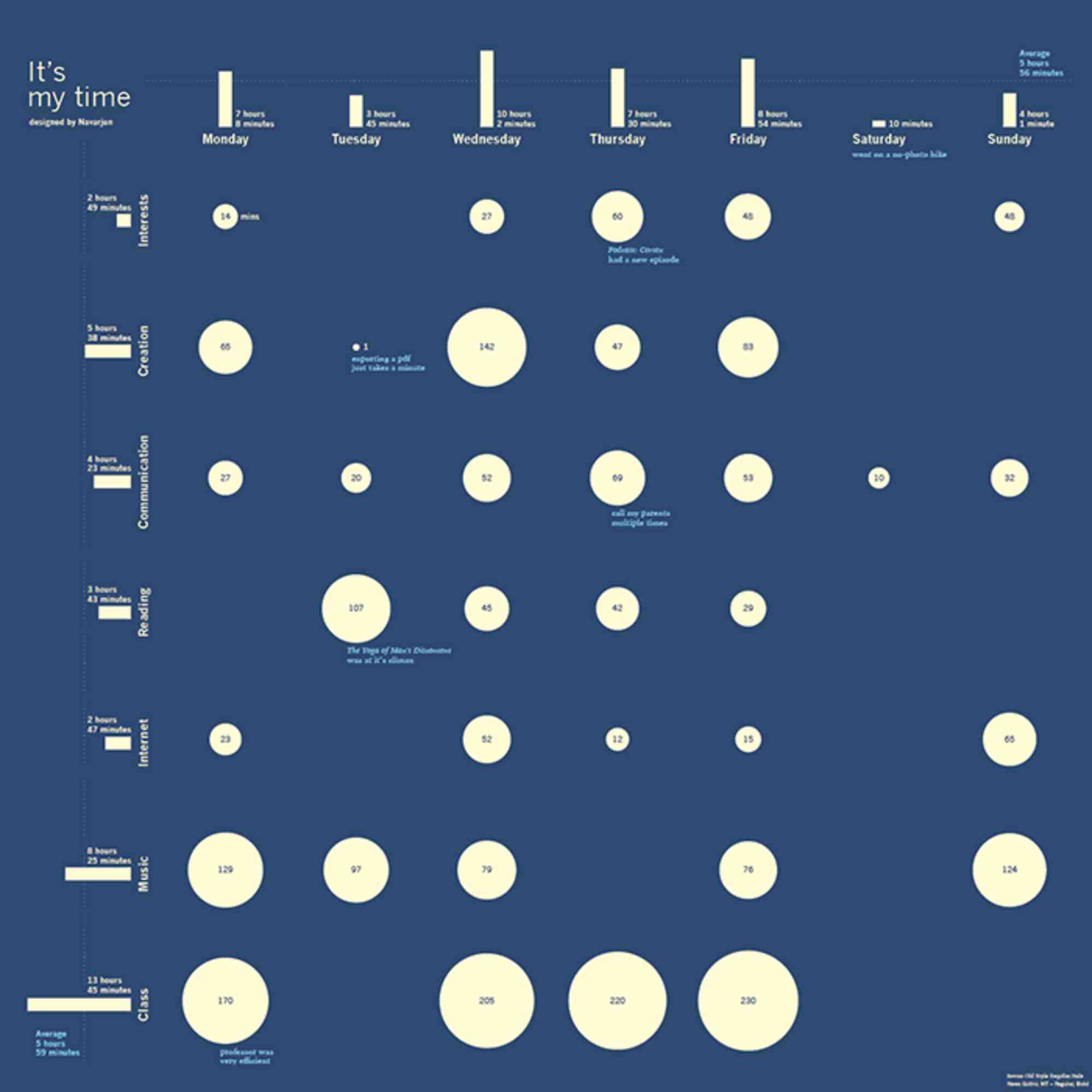
It looks great in print (17x17 inches poster). If anyone wants it, please tweet at me @Navarjun, I can send you a printed version. :)